Mastering Responsive Design with Shiwagrid
Building responsive websites doesn't have to be a headache. With Shiwagrid, we've focused on making the developer and designer experience as smooth as possible.
In this post, we'll dive into how Shiwagrid handles complex layouts across different devices, ensuring your site looks perfect everywhere.
The Mobile-First Approach
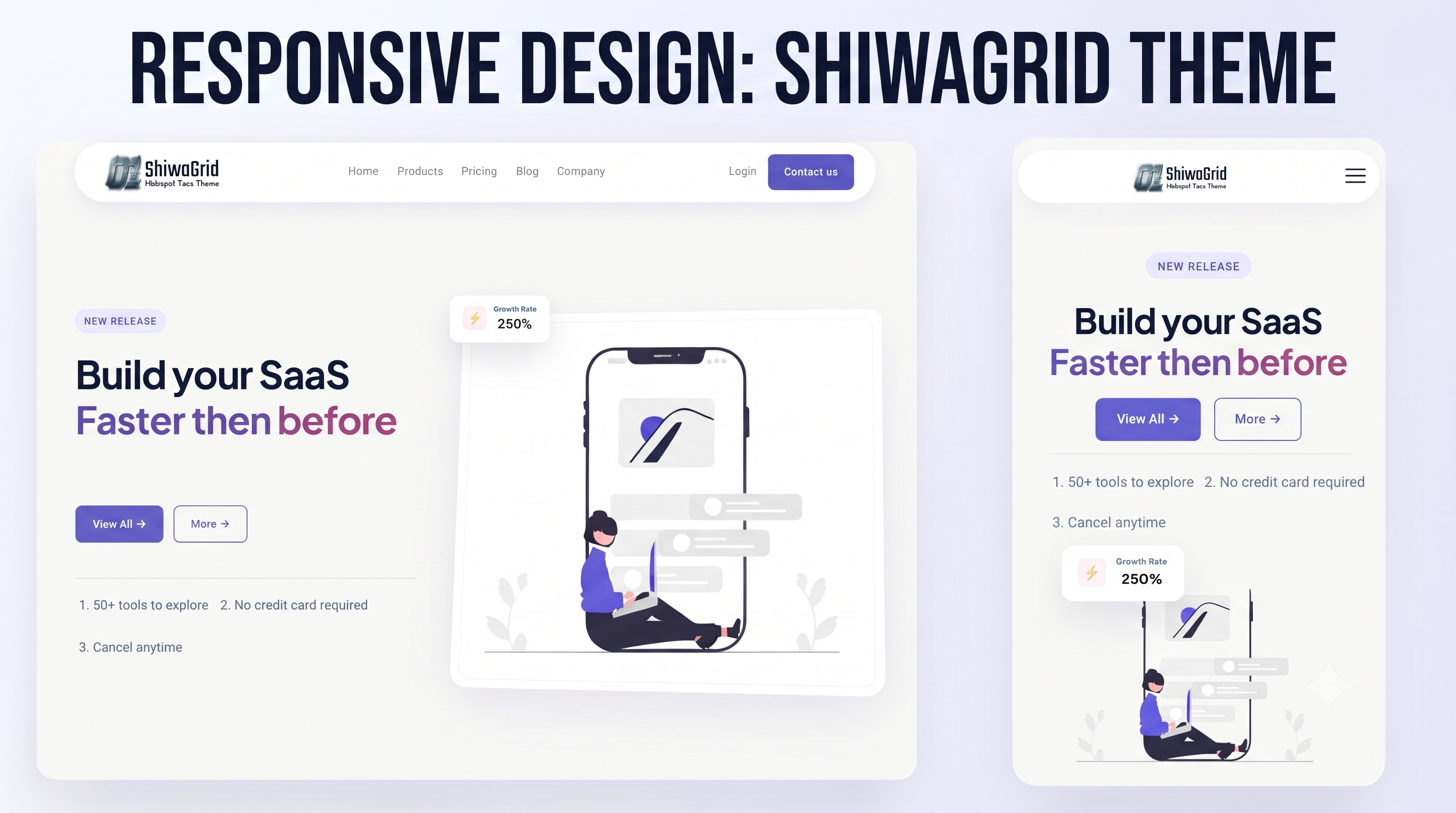
Shiwagrid is built with a mobile-first philosophy. This means your base styles load quickly on smaller devices, and scale up beautifully as the screen size increases.
Why Mobile-First Matters:
- Performance: Mobile devices process less CSS, making your site faster on slower connections.
- Predictability: Layouts behave consistently when scaling up rather than trying to shrink complex desktop layouts down.
- Customization: It’s incredibly easy to override breakpoints only when necessary.
Feature Comparison
To see why a dedicated grid system is so helpful, let's look at how Shiwagrid compares to traditional layout methods. Here is a quick breakdown using a standard data table:
| Layout Feature | Traditional Methods | Shiwagrid System |
|---|---|---|
| Setup Time | High (lots of custom CSS) | Low (plug and play) |
| Vertical Alignment | Difficult and frustrating | Intuitive & Automatic |
| Responsiveness | Requires heavy Media Queries | Built-in by default |
Fluid Media Handling
Images and videos are often the trickiest part of responsive design. Shiwagrid handles them fluidly so they never break out of their containers.
Demo Tip: Try inserting a large image right below this paragraph in your HubSpot editor to see Shiwagrid's fluid image scaling in action!
Code Example
Here is an example of how Shiwagrid wraps media cleanly:
<!-- Example of how Shiwagrid wraps media -->
<div class="shiwagrid-col-6">
  <img src="demo-image.jpg" alt="Responsive Demo" class="img-fluid">
</div>
Conclusion
Shiwagrid is designed to save you time while delivering pixel-perfect results. If you are viewing this on a desktop, try resizing your browser window right now to see how this very page adapts seamlessly!