Welcome to the Shiwagrid Demo: Revolutionizing Web Layouts
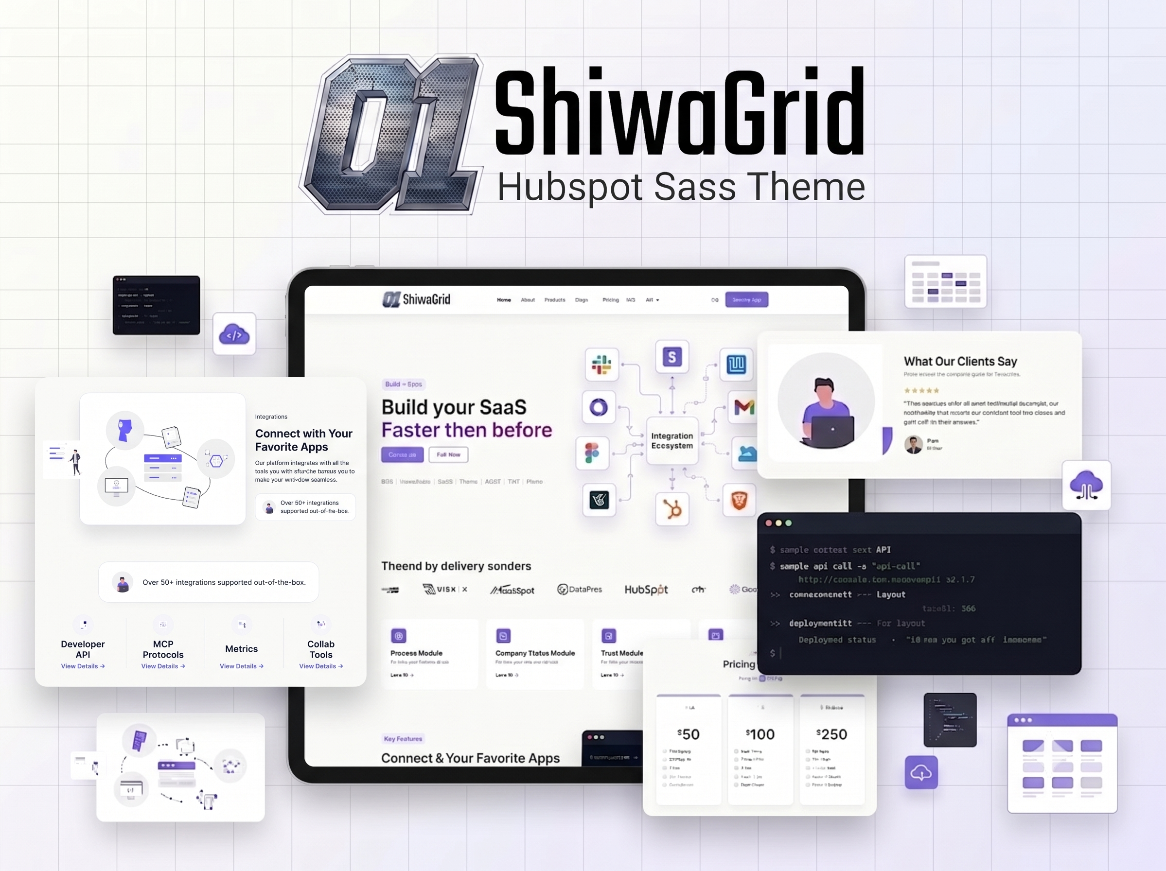
Welcome to our first official test post for Shiwagrid! If you're reading this, you are currently experiencing the Shiwagrid demo in action.
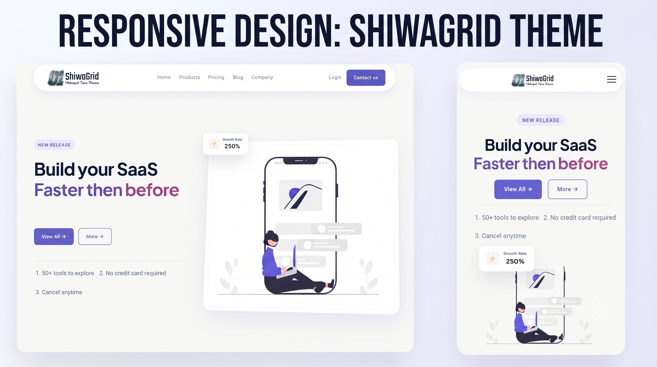
This blog post serves as a live environment to test and showcase how Shiwagrid handles various content types, typography, and responsive design structures. Whether you are building a simple landing page or a complex web application, a reliable grid system is the backbone of great design.
Why Shiwagrid?
In the modern web development landscape, designers and developers need tools that are both powerful and adaptable. Shiwagrid was built with a few core principles in mind:
- Flexibility: Easily adapt to any screen size, from mobile phones to ultra-wide monitors.
- Simplicity: Clean, intuitive classes and structures that don't bloat your HTML.
- Consistency: Perfect alignment and spacing every single time.
"A great grid system doesn't constrain your creativity; it provides the invisible foundation that allows your designs to shine."
Testing the Layout
To properly demonstrate the capabilities of Shiwagrid, we are using this post to test different HTML elements. Notice how the text flows, how the margins behave, and how the grid maintains structural integrity.
Typography & Spacing
Good typography is essential for readability. Here is a quick look at how features are handled within the grid:
Responsive Columns
Watch how content wraps seamlessly across all viewing devices.
Gutter Control
Precise spacing between elements to keep layouts airy and balanced.
Vertical Alignment
No more struggling to center items or fix broken floats.
Code Example
We can also test how code blocks fit cleanly within the layout:
.shiwagrid-container {
  display: grid;
  grid-template-columns: repeat(12, 1fr);
  gap: 20px;
}
What's Next?
As we continue to test and refine Shiwagrid, expect more updates, features, and complex layouts to be added to this demo. We are excited to see what you will build with it!
Stay tuned for more updates, and happy coding!